I recently finished a stint filling in at my old job. One of the authors I designed a cover for over the past few weeks was especially thrilled with my work, so I thought I'd share it here.
Front:
Back:
The design started out much worse than it ended up. I figured out pretty early on that the photograph I'd considered using wasn't going to cut it (pun intended), so nixed it after a couple of attempts to integrate it, and went all free-hand with the pen tool in illustrator working up layers . . .
The book is forthcoming this month from Wipf & Stock Publishers. You can also follow the blog of the author, Sarah Wells, just by clicking her name.
Thanks for reading! If you have any questions about book cover design, please put 'em in the comments below, and I'll do my best to answer them, using my (limited) knowledge. Chip Kidd I ain't.
(p.s. You can make the images on this page larger just by clicking on them, but you probably already knew that.)
Showing posts with label illustration. Show all posts
Tuesday, June 5, 2012
Thursday, May 24, 2012
new blog look!
The blog's been needing an update for awhile, something tied in to the Night Garden image a little more. I found this cool 1920s (copyright free!) star chart over on the Graphics Fairy blog and used it as the basis for the backgrounds.
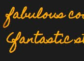
I changed up the post heading font, too, to be more readable. I loved the hand-writing feel of the old font, but some glyphs were hard to make out, and the funky spacing had always been a thorn in my side. The new post headers
keep something of the casual vibe, while being presented in a font with fewer quirky little glitches.
There are a few other changes, mostly subtle color shifts and font size alterations. And, I struggled for awhile to find a way to use the illustration in the sidebar of the boy looking at the stars. It's someone else's, you see. I pinned it awhile back on my Design Love pin board over at Pinterest because I love it so much, but because I'm not sure it's past its copyright date yet, I figured the most honorable thing to do would be to link it back to a place to buy the book from which it came.
Here's a little reminder about how things used to be vs. the way they are now. . .
old header:
new header
old background
new background
old font
new font
I'd love your feedback on the new look!
Thanks for reading!
I changed up the post heading font, too, to be more readable. I loved the hand-writing feel of the old font, but some glyphs were hard to make out, and the funky spacing had always been a thorn in my side. The new post headers
keep something of the casual vibe, while being presented in a font with fewer quirky little glitches.
There are a few other changes, mostly subtle color shifts and font size alterations. And, I struggled for awhile to find a way to use the illustration in the sidebar of the boy looking at the stars. It's someone else's, you see. I pinned it awhile back on my Design Love pin board over at Pinterest because I love it so much, but because I'm not sure it's past its copyright date yet, I figured the most honorable thing to do would be to link it back to a place to buy the book from which it came.
Here's a little reminder about how things used to be vs. the way they are now. . .
old header:
new header
old background
new background
old font
new font
I'd love your feedback on the new look!
Thanks for reading!
Subscribe to:
Posts (Atom)