The blog's been needing an update for awhile, something tied in to the Night Garden image a little more. I found this cool 1920s (copyright free!) star chart over on the Graphics Fairy blog and used it as the basis for the backgrounds.
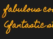
I changed up the post heading font, too, to be more readable. I loved the hand-writing feel of the old font, but some glyphs were hard to make out, and the funky spacing had always been a thorn in my side. The new post headers
keep something of the casual vibe, while being presented in a font with fewer quirky little glitches.
There are a few other changes, mostly subtle color shifts and font size alterations. And, I struggled for awhile to find a way to use the illustration in the sidebar of the boy looking at the stars. It's someone else's, you see. I pinned it awhile back on my Design Love pin board over at Pinterest because I love it so much, but because I'm not sure it's past its copyright date yet, I figured the most honorable thing to do would be to link it back to a place to buy the book from which it came.
Here's a little reminder about how things used to be vs. the way they are now. . .
old header:
new header
old background
new background
old font
new font
I'd love your feedback on the new look!
Thanks for reading!
Showing posts with label graphic design. Show all posts
Thursday, May 24, 2012
Tuesday, April 17, 2012
two new spoonflower fabric designs
Spoonflower's hosted a couple of fabric design contests lately that were right up my alley. First up, designs inspired by a love of books.
Assuming there'd be a ton of bookshelf designs, book stacks, etc., I looked back over my history with books, a history that begins with a story my mom tells about tiny little me, in my crib, quietly looking at picture books. Now, I worked through most of my twenties (and the beginning of my thirties) in bookstores (and the past several years designing book covers), but as a kid, I was a pretty constant library patron.
When I got old enough to walk the eight or so blocks after school, we used to spend a couple of hours a day at the public library until our dad could pick us up. Hours we spent spinning the globe, looking up swear words in the dictionary, and, of course, reading. And during that time, I encountered thousands of these library checkout slips. And probably thousands more at the school library, too.
Click here for the full design, featuring four different YA library slips created in Illustrator and Photoshop, without the aid of scans. In fact, created without the aid of my drawing tablet, too, since I couldn't find the pen. Each of the kids' signatures were done using different Photoshop brushes and my mouse. And I think I used either three or four open typewriter-style fonts.
I placed 22nd out of 143, which is cool with me.
Next up was the "Sewing Celebration" contest. Again, I mined my happiest childhood memories. My kindergarten teacher had a shelf full of fun kits that kids could take home to make a little project or do a little activity. Among the dozens I must have taken home, I remember best a little felt bean bag I stitched together with red yarn.
The kit included chartreuse green felt, red yarn, pins, needles, and beans. And my stitches were so huge that the beans would sometimes slip out from between them. I've become a better sewist over the years (luckily, 'cause I was losing a whole lot of beans), and my five-year-old self could never have imagined something as fabulous as Spoonflower, but she would have loved it. And so would my kindergarten teacher.
Click here for the full design. I think you can even still vote, if you're interested, for a couple more hours. Contest results tba!
(p.s. you can make these photos bigger by clicking on them . . . but you probably knew that!)
Assuming there'd be a ton of bookshelf designs, book stacks, etc., I looked back over my history with books, a history that begins with a story my mom tells about tiny little me, in my crib, quietly looking at picture books. Now, I worked through most of my twenties (and the beginning of my thirties) in bookstores (and the past several years designing book covers), but as a kid, I was a pretty constant library patron.
When I got old enough to walk the eight or so blocks after school, we used to spend a couple of hours a day at the public library until our dad could pick us up. Hours we spent spinning the globe, looking up swear words in the dictionary, and, of course, reading. And during that time, I encountered thousands of these library checkout slips. And probably thousands more at the school library, too.
Click here for the full design, featuring four different YA library slips created in Illustrator and Photoshop, without the aid of scans. In fact, created without the aid of my drawing tablet, too, since I couldn't find the pen. Each of the kids' signatures were done using different Photoshop brushes and my mouse. And I think I used either three or four open typewriter-style fonts.
I placed 22nd out of 143, which is cool with me.
Next up was the "Sewing Celebration" contest. Again, I mined my happiest childhood memories. My kindergarten teacher had a shelf full of fun kits that kids could take home to make a little project or do a little activity. Among the dozens I must have taken home, I remember best a little felt bean bag I stitched together with red yarn.
The kit included chartreuse green felt, red yarn, pins, needles, and beans. And my stitches were so huge that the beans would sometimes slip out from between them. I've become a better sewist over the years (luckily, 'cause I was losing a whole lot of beans), and my five-year-old self could never have imagined something as fabulous as Spoonflower, but she would have loved it. And so would my kindergarten teacher.
Click here for the full design. I think you can even still vote, if you're interested, for a couple more hours. Contest results tba!
(p.s. you can make these photos bigger by clicking on them . . . but you probably knew that!)
Monday, March 12, 2012
too much . . . zapfino?
"Zapfino is a calligraphic typeface designed for Linotype by typeface designer Hermann Zapf in 1998. It is based on an alphabet Zapf originally penned in 1944. As a font, it makes extensive use of ligatures and character variations (for example, the lower case letter d has nine variations). --From the Wikipedia article about Zapfino
When I was getting started as a cover designer, I used to turn to Zapfino reasonably often because of its elegant letter forms, and the EXTENSIVE glyph palette. Five years later, I tend to stay away from it because I started seeing it everywhere. Because it's a display font, it's instantly recognizable. Is it time for Apple to add a brand new calligraphic typeface/font to its programs as a substitute? Has Zapfino possibly been overused?
Deborah Norville yarn at JoAnn Fabric

Sidewalk advertising sign for local lingerie store

Display of Christmas party ware at Fred Meyer

JoAnn Fabrics mailer

Hummingbird Organics logo (from their website)

Bread wrapper from Fred Meyer bakery

Premarin Vaginal Dryness Cream ad in Country Living magazine

(p.s. you can make these photos bigger by clicking on them . . . but you probably knew that!)
When I was getting started as a cover designer, I used to turn to Zapfino reasonably often because of its elegant letter forms, and the EXTENSIVE glyph palette. Five years later, I tend to stay away from it because I started seeing it everywhere. Because it's a display font, it's instantly recognizable. Is it time for Apple to add a brand new calligraphic typeface/font to its programs as a substitute? Has Zapfino possibly been overused?
Deborah Norville yarn at JoAnn Fabric

Sidewalk advertising sign for local lingerie store

Display of Christmas party ware at Fred Meyer

JoAnn Fabrics mailer

Hummingbird Organics logo (from their website)
Bread wrapper from Fred Meyer bakery

Premarin Vaginal Dryness Cream ad in Country Living magazine

(p.s. you can make these photos bigger by clicking on them . . . but you probably knew that!)
Friday, February 3, 2012
zelda invitations featuring our hero, link!
It's very difficult to find Zelda birthday party invitations, or anything to do with a Zelda birthday party, for that matter. For some reason, Mario is EVERYWHERE, while our valiant hero, Link, languishes in kid party obscurity.
So I made these from scratch. Or rather, from Adobe Illustrator, and paper, and my inkjet printer, and some foam mounting tape. But mostly scratch.

I found a few images of Link from the original Zelda game on-line, and, using the grid lines in Illustrator, drew out Link one little box at a time (using the copy/paste function and the eye dropper tool). Because I drew Link in Illustrator, a vector art program, Link can be sized up or down infinitely without added pixelation or distortion. Which means I can use this same image for the invitations, or t-shirt transfers, or stickers, or large character cut-outs, or posters . . . pretty cool, and one of my favorite things about using Illustrator over using Photoshop.

Next, I laid out my text, using two free fonts I found on an on-line font website (dafont, I think). One font looks like a vintage video game font; the other strongly resembles the font from the Legend of Zelda box. Love it!


I'll spare you the details; assembly was pretty straightforward. Let's just look at some more photos!


(p.s. you can make these photos bigger by clicking on them . . . but you probably knew that!)
Of course, party details have been changed or omitted for privacy reasons. Now accepting clients for custom party invitations.
Pin It
So I made these from scratch. Or rather, from Adobe Illustrator, and paper, and my inkjet printer, and some foam mounting tape. But mostly scratch.

I found a few images of Link from the original Zelda game on-line, and, using the grid lines in Illustrator, drew out Link one little box at a time (using the copy/paste function and the eye dropper tool). Because I drew Link in Illustrator, a vector art program, Link can be sized up or down infinitely without added pixelation or distortion. Which means I can use this same image for the invitations, or t-shirt transfers, or stickers, or large character cut-outs, or posters . . . pretty cool, and one of my favorite things about using Illustrator over using Photoshop.

Next, I laid out my text, using two free fonts I found on an on-line font website (dafont, I think). One font looks like a vintage video game font; the other strongly resembles the font from the Legend of Zelda box. Love it!


I'll spare you the details; assembly was pretty straightforward. Let's just look at some more photos!


(p.s. you can make these photos bigger by clicking on them . . . but you probably knew that!)
Of course, party details have been changed or omitted for privacy reasons. Now accepting clients for custom party invitations.
Pin It
Monday, December 5, 2011
honeybees for heifer international
Once again this year, I'm donating my entire commission from this December's sales of my Honeybees for Heifer International fabric collection (both the vintage and modern styles) to Heifer, a non-profit organization that gifts families around the world with livestock, beekeeping equipment, and trees. These gifts help farms become profitable and keep people out of poverty and starvation.


Pin It
These two images are two samples from the collection, the large modern and vintage worker bees. There are twenty coordinating fabrics in all, ten each in vintage and modern finishes.
To purchase fabric from this collection, you can visit my Honeybees for Heifer International collection page by clicking here. Thanks for helping me support a great organization!
(p.s. you can make these photos bigger by clicking on them . . . but you probably knew that!)

Pin It
These two images are two samples from the collection, the large modern and vintage worker bees. There are twenty coordinating fabrics in all, ten each in vintage and modern finishes.
To purchase fabric from this collection, you can visit my Honeybees for Heifer International collection page by clicking here. Thanks for helping me support a great organization!
(p.s. you can make these photos bigger by clicking on them . . . but you probably knew that!)
Monday, November 28, 2011
pioneers of american industrial design stamps
I'm very fond of this recent stamp release from the USPS, featuring beautiful examples of industrial design.

The works and designers featured in this stamp set proved that form and function could be perfectly married, and the stamp set itself has a nice, clean, modern design.
Other reasons to pick up a few sheets for your holiday cards: they're great for using after the holidays, too; they're "Forever" stamps, so they'll cover the first class cost of mailing a letter indefinitely (stock up!); and they speak to a vintage design aesthetic that's very current, making them a great choice for designers' business mailings.
* I'm not compensated for my reviews of various design products; I just like to call attention to things I think are beautiful.
Photo credit: USPS. Photo is used here for the purpose of review, and links back to the purchase page for this stamp set.
(p.s. you can make these photos bigger by clicking on them . . . but you probably knew that!)

The works and designers featured in this stamp set proved that form and function could be perfectly married, and the stamp set itself has a nice, clean, modern design.
Other reasons to pick up a few sheets for your holiday cards: they're great for using after the holidays, too; they're "Forever" stamps, so they'll cover the first class cost of mailing a letter indefinitely (stock up!); and they speak to a vintage design aesthetic that's very current, making them a great choice for designers' business mailings.
* I'm not compensated for my reviews of various design products; I just like to call attention to things I think are beautiful.
Photo credit: USPS. Photo is used here for the purpose of review, and links back to the purchase page for this stamp set.
(p.s. you can make these photos bigger by clicking on them . . . but you probably knew that!)
Sunday, October 2, 2011
free printable letterpress - style poster
I made this to put in my kiddo's room, and decided to share the love! Feel free to print for personal use. (conditions appear after the jpgs)


If you post on your blog, please link back to me and give credit. Selling electronic files or prints of this design is prohibited. Basically, be fair, be honest, respect others' work!
(p.s. you can make these photos bigger by clicking on them . . . but you probably knew that!)
Pin It


If you post on your blog, please link back to me and give credit. Selling electronic files or prints of this design is prohibited. Basically, be fair, be honest, respect others' work!
(p.s. you can make these photos bigger by clicking on them . . . but you probably knew that!)
Pin It
Friday, July 22, 2011
penguin classics
Sometimes, I daydream about illustrating book covers like these, from the Penguin Classics collection.
This one, for Huck Finn, is my favorite. I love the sunny color palette and the quartered layout, which neatly divides the cover. But the line drawings are just charming, and that's what sells it for me. I've already read The Adventures of Huckleberry Finn, I already have a copy, but this is one I'm thinking of picking up for the kiddo because of the cover art. See? Cover design is important!

Here are a few more lovelies from the series:


This one, for Huck Finn, is my favorite. I love the sunny color palette and the quartered layout, which neatly divides the cover. But the line drawings are just charming, and that's what sells it for me. I've already read The Adventures of Huckleberry Finn, I already have a copy, but this is one I'm thinking of picking up for the kiddo because of the cover art. See? Cover design is important!

Here are a few more lovelies from the series:


Friday, July 8, 2011
spoonflower love
A really cool e-mail came the other day from another Spoonflower user named Julie, who recently purchased some of my Mums-Red print. Seems she made a nifty little handbag from it, and wanted to know if I'd like to see a picture! I did! She agreed to let me share it; I'm always so pleased when someone makes something cool from one of my designs. Thanks again, Julie! You rock!
Wednesday, June 29, 2011
Wednesday, March 16, 2011
design work
I threw together this interactive PDF portfolio of some of my graphic design work about a month ago. It includes cover and flier designs from my work at Wipf and Stock Publishers, where I still work part time from home. Enjoy!
Portfolio
Portfolio
Tuesday, October 27, 2009
Monday, June 1, 2009
Tuesday, May 5, 2009
peter pan-sies!
I'm spending a fair amount of my free time lately making stuff for this:

This is an early draft of the poster. Mostly hand done, with alterations and additions made in Illustrator. After a few more additions and subtractions, I'll post the final result here!
I'm also making a bunch of props, set pieces, and costumes. If you'll be in town during the play dates, please come see! It's an ambitious project for a community theater group (read: no budget), but the cast is well-assembled, and I think the creative energy is well worth the effort.
Labels:
art,
crafts,
design,
drama,
graphic design,
Nana,
overworked,
Peter Pan,
play,
poster
Subscribe to:
Posts (Atom)


