Sunday, September 29, 2013

fix-it felix golden hammer

Because I won't hand a three-year-old a hammer spray-painted gold, I had to come up with another idea for the kiddo's Halloween costume hammer.


I could have used a regular toy hammer and spray painted that gold, but I thought something scaled a little more cartoonishly large would be fitting for Fix-It Felix.

I used a 90-cent piece of foam pipe insulation from the hardware store (it's sold in six-foot lengths), a piece of doweling that fit the space in the center, and some duct tape in regular and gold colors.


The handle is cut from an 18-inch piece, with an 8-inch top and two 1.5-inch pieces for the hammerhead.


I used an 18-inch dowel to connect the pieces.


The two pieces of the hammer head fit around the end.


Here's another photo to help illustrate how they fit (some trimming will be necessary to help them fit exactly).


 Then I trimmed the other end to make it look more like a hammer. The bits I cut off were used to fill the hollow spaces at the end of the handle and the hammerhead.


I secured all of the parts together with a layer of standard duct tape. Kids are kinda rough on stuff, so I made sure everything was extra sturdy.


Finally, a decorative layer of shiny gold duct tape to make it shine!


And there you have it! A perfect Fix-It Felix hammer.


You can click here to see how I made a Fix-It Felix cap for the kiddo's costume and here for a tutorial on the shirt and patch . . . and of course, here for my post on Felix's tool belt, pants, and boots. Thanks for reading!


Monday, September 23, 2013

now available in metric: measuring tape growth chart!

Hey friends! I designed a version of this growth chart a while back, and put it up for sale in my Spoonflower shop and on Etsy.


Well, good news for those of you who operate on the metric system; I've designed a version just for you!


Just as on the original, the background is an enlarged antique linen print.


You can check it out over on Spoonflower and Etsy, available for purchase now as either unfinished fabric or a finished growth chart. You can even see my previous blog entry with instructions on how to assemble it.


 Thanks for reading!

Sunday, September 22, 2013

why do i fix everything i touch?!?

Guess what the big plan is for this year's family Halloween costumes?


The little guy is going as Fix-It Felix. I'm going to let you reach your own conclusions about the costumes the other two of us will be wearing. (Hint: I'm milking this "family costume" thing again, under the assumption the kiddo isn't going to let us do it for too much longer.)

This hat's a pretty easy project to work up with felt and a ball cap, although I had several false starts involving grand delusions of embroidering with the zig-zag function of my sewing machine. Urgh.

The hat was a "misprint" that I picked up -- new with tags -- from Goodwill for $1. I picked out enough of the stitches from the hat's original embroidered pattern that the felt patch would cover what was left. You can see where the lettering used to be, and part of the bulldog's tail.


I used stiffened EcoFelt sheets called Friendly Felt for the patch. You can find it (or something similar) in probably any craft or fabric store; mine came from the aisle of JoAnn Fabrics that houses the other felt craft sheets. I think it cost a buck?


 The yellow piece is 3 inches square with the corners cut off. I cut a blue square a little smaller.


Then I cut out the letters from the navy blue square . . .


. . . and stitched them in place on the sewing machine.


To attach it to the hat, I hand-stitched.


More to come! What have you got going at your house for Halloween this year?

Update: you can check out the shirt and patch + golden hammer + tool belt, pants, and boots tutorials now!

Thursday, September 19, 2013

big fun for halloween


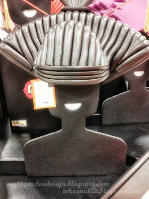
We were browsing the Halloween stuff at Target this week and ran across a fabulous display of costume wigs made of foam. It's pretty amazing stuff. Simple designs made of built up layers.


 They look better in person and on Chris March's website than they do in my cell phone pics (I can sometimes get some nice shots outside, but everything gets washed out indoors). So after you take a look at the rest of these photos, pop over to Chris's site to see them in actual color.


I remembered Chris's work on Project Runway as soon as his site loaded up. The Big Fun collection is pretty much perfectly him.


 If I had more space in my house I'd buy one; they're pretty reasonably priced (under $20). But there's no way I'd be able to throw it out after the holiday. I'd just want to keep it, and, well, with the Kermit and Fozzie heads from Halloween last year, the Wild Thing head from Halloween two years ago, and the birthday robot from the kiddo's birthday party all still hanging around, it's already looking a bit backstage 'round here.


So you, go forth and be my proxy. Add one to your Halloween get-up (it'll be way cooler than some faux-hair thing your cat will be coughing up bits of a week later). And then frame it or something, because each of these designs is pretty damn fantastic.


Thanks for reading!

p.s. no pay or perks, here; I just like cool things made from simple materials.


Tuesday, September 17, 2013

mammoth sunflower seeds


My sister-in-law packaged up some seeds a couple of Christmases ago and sent them out to all of us. Over that summer, she and my brother and the kids had grown the Mammoth sunflowers (possible varietal name Russian Mammoth) in the backyard, and we were assured that they'd been HUGE.


They sprouted well, even after more than a year of waiting to be planted. The above photo is from early May, when the seeds we'd started got transferred into the beds.

This one is from late August, when the sunflower stalks surpassed roof height on the studio.


I've grown some sort of Mammoth sunflower in the past, but I don't recall the flowers ending up quite as huge as these. A twelve-foot stalk and a sixteen-inch head were the largest we measured this year; most of the heads were in the twelve-inch range!


I'll be passing them back around this year; I know my sister-in-law is looking forward to keeping the seed swap going!


I have a seed packet design I'll be sharing in a future post, so check back soon if that's your thing!

Thanks for reading!

updated: seed packets? right here!

Thursday, September 12, 2013

succulents in vintage glassware

A simple project for centerpieces, gifts, or window gardening.


Vintage highball glasses, punch cups, and candle bowls are filled with pebbles (for drainage), potting soil, and a little hens-and-chicks succulent varietal each.


They need to be kept out of all-day sunlight and watered once in awhile, but succulents aren't too hard to keep alive.


These look awesome clustered as wedding centerpieces, and equally nice in a kitchen window. Which makes them perfect (upcycled, green) wedding favors, if you think about it.

Thanks for reading!

Linking up to:

Monday, September 9, 2013

siding: the sequel

We spent part of the weekend finishing up the siding and cedar shakes on the sides of the studio building. It's been in progress for a long time coming, and I'm happy to say the end is in sight (knock on cedar).

The siding is cement fiber board lap siding, the same stuff we used on our house. It also matches the cedar plank siding on the tool shed. Both of those buildings are painted yellow with MetroPaint Sweet Corn (which, by the way, is nowhere near as bright as the screen displays it on their color chart, thank goodness). The studio's siding hasn't been painted yet; it came primed this yellow-ish color.


The cedar shakes at the top have a fun history on our property; they came with our cedar shed kit as roofing material, which wasn't going to work for us, longevity-wise. We used some to shake the roof peak on the west side of the studio. We used some more to side a playhouse, which was later disassembled for being a spider haven. Those were repurposed here when we finally got around to adding shakes to the east side roof peak yesterday afternoon.  Thank goodness for nice weather and a weekend coinciding in the PNW in September.


And here's the west side, behind a garden-gone-wild at summer's end. This side, too, only recently got the lap board siding (over this past summer, and finishing up Saturday night), but it's had the cedar detail for awhile.


Here it is when it was fresh!


How long ago, you might ask? Answer.

Oh man, we're so close. Just a couple of boards on the front and some caulk and paint, and all three structures will match. It's going to be freaking AMAZING.


Thanks for reading!

Thursday, September 5, 2013

aging painted metal signs

I've done a couple of posts now on how to make vintage-look painted signs on metal panels, but I'm still perfecting my methods as I work my way up to a large project. I have a patch of fence, though, in the backyard, that is chain link, and ugly, and has a tiny dog on the other side (a pomeranian, I think) who likes to bark at us when we're minding our own business in our own yard (but only when he can see us). And I had some metal panels laying around, ready to get made into signs.

A project for every purpose, hmmm?


So, let's not talk about how I should have used a template before taping and spraying so that everything would look a little more professional. I freehanded this in chalk and then taped around it; I know it doesn't exactly dress to impress. But I would like to write a little about my experiments with aging. Aging the sign, that is, not myself. (*wink*)

First, I started with a cream painted metal panel from Bring, the recycled building store where I pick up a lot of my project materials. As you can see in the sanded spot in the photo below, there were three other layers of paint under the cream: tan, brown, and gray before the steel shows through. Picking a panel with a lot of layers of old paint in dated colors is a great first step towards making something look vintage, I think.


After I taped my lines, I sprayed with a flat black primer, and then three very light coats of cherry red. Some of the black still shows through, with I think lends some nice age.

You can tell from the above photo there is a flat finish to the red paint. It was glossy out of the can, but if you hit anything with enough scrubber pads, sandpaper, and steel wool, you can dull the finish pretty nicely. 

As you see here, my next method to aging is to scrub all the way through the layers of paint in several areas, down to the bare metal. I made the patches somewhat random in order to look like "natural" aging. 

And then, of course, rust. I scrub the area with salt while it lays flat, then spray with vinegar and leave it to do its thing. Voila! (It's still wet in this photo, but you can still make it out.)


Ah, rust. I left this laying flat in the rain for a couple of days, which helps hasten the process.


I let the kiddo dance on it a bit, too, to give it some dents and chips.


So, the aging is going well, and this hides a pomeranian. Mission accomplished!


Stay tuned, as I'm in the middle of another sign project I'll be sharing soon. This one is even bigger and way cooler.

Thanks for reading!