

Showing posts with label design. Show all posts
Showing posts with label design. Show all posts
Friday, July 29, 2016


Monday, July 28, 2014
sun printing on fabric (seriously the best surface design project of the summer)

I spent several years at the university earning my BA in art. The last couple of years that I was in school, I was especially drawn in by the fiber arts program. I spent an entire summer term dyeing with indigo vats, for example, and another term learning natural dyeing techniques (with plants and things). I learned to carve stamps and print with acrylic paint, screen print with a Thermofax, photocopy directly on fabric. I learned about resists and cyanotype. I designed costumes and learned the art of sashiko. I tie dyed and sewed and painted and printed and felted and spun . . . and somehow, in all those years of art and fiber classes, I never learned how to sun print on fabric using only acrylic paint, water, and leaves.

It's amazing, really, the many varied ways there are to apply color to surfaces. This effect, in particular, can be obtained a number of ways. I once made an umbrella into a tree canopy for a play, for example, by holding branches and leaves against the umbrella and lightly spraying with spray paint. Cyanotype paper and cyanotype ink can each be used to make sun prints. You can also make simple sun prints on construction paper just by leaving the leaf-covered paper in the sun for a few hours.
This project, though, is astounding in its simplicity. I had all the materials on hand (you can use any fabric paint or acrylic craft paint; the paint shown is Kid Made Modern fabric paint from Target, the same stuff we used on the baby shower onesies awhile back), the set up is simple enough for kids and grown-ups alike, and the results are stunning.

Seriously Easy Sun Printing Tutorial
1) Take a piece of fabric (muslin, canvas, etc., with at least 50% cotton content) and get it wet.

2) Squeeze out the excess water.
3) Stretch and pin to a board.

4) Pour a little paint and water into a container, and stir to mix.


5) Cover the surface of your fabric with thinned paint solution.
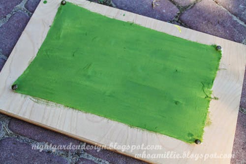
6) Cover the wet, painted surface with leaves, twigs, berries, etc.

7) Leave it in the bright sun, then check on it in about an hour. If the sun is weaker, leave it longer.

And that's it.

The capillary action draws the paint from the shaded portions (under the leaves) into the drier, unshaded portions, leaving lightly colored leaves on a darker colored background.

After your fabric has dried completely, put it in the dryer for a few minutes to heat set the paint, or iron with a cloth. It'll be safe to incorporate into a project and wash.

I'll never be done learning new things, it seems. Isn't that fantastic?

Thanks for reading!
Monday, March 31, 2014


Tuesday, December 31, 2013
design/spring's second annual gingerbread competition
I missed out on participating again this year, but next year I'm totally entering some type of crazy gingerbread construction into Design/Spring's 3rd Annual Gingerbread Competition. The architecture runs the gamut from traditional to avant garde. Here are a few samples from the early hours of the competition this year, as the entries began to arrive.
Hershey bar solar array! Rice cake water cistern!

A trio from the family competition.

Nice piping on this one, from the dangling icicles to the trees and wreaths.

Fully iced lighthouse, complete with a photo of the inspiration structure.

Another lighthouse with gingerbread tourists and marine life.

There's even a gingerbread boy buried in the sugar sand in the lower right hand corner.

Graham crackers with licorice roof.

Love this gingerbread multi-story building with sugar glass shards on the roof and the dyed coconut/gumdrop flower/cookie stepping stone landscaping.

And to contrast it, a traditional village of tiny houses.

Despite missing the competition, I did sit down with my kiddo to decorate a gingerbread house of our own. We used a kit from Wilton so we could get right to the fun part (bonus: some stores start putting their Christmas items on clearance right before the holiday; we picked up this kit for $5).

If we do one of these next year, I'll try to remember that there are two colors of icing included, but only one decorating bag. We ended up with an interesting combination of "snow" and "grass", kinda like after the snow from that storm started to melt a few weeks back.

So, did your family get in on the gingerbread fun this year? Anyone have a preschooler who actually uses more candy to decorate than to eat? Tell me all about it.
Thanks for reading!
Friday, December 27, 2013
wine labels for home vintners (mean hermit edition)
My "spirited" family is full of home brewers and vintners, a hobby many seem to have inherited from my grandpa. Late in life he developed an interest in making his own alcoholic concoctions; if you knew him, you know this was just one of the quirky and amazing things about him from a field of thousands.
This year my aunt and uncle made both wine and beer, and phoned in to ask me to do a little run of wine labels like I did a while back. I riffed off of the "Mean Old Hermit" sign that has hung on the gate of their rural property since time immemorial. This is what I came up with (the names here have been redacted for privacy):

A Google search turned up an old 1920s (copyright free) image of an old bootlegger simultaneously smoking a pipe, brandishing weapons and holding a liquor bottle. Perfect. I wasn't there to see my aunt and uncle open the package, but they tell me there was much laughter.
To make the two-toned sketched image, I used a very fine-lined drawing tool in Illustrator and, with my pen/stylus and drawing tablet in a separate layer, I drew over the highlights. When I was done, I dropped in the black background and added typography (fonts are 1942 Report, Rustic Regular {from Dover}, and Cavalcade).

Once I'd printed them out on label paper using my ink jet (because the local print shop took five days to return my e-mail), I gilded the 2012 using a gold paint pen and sprayed the labels with Mod Podge acrylic spray. I let them dry and air out for a couple of days before cutting them apart and packaging them up.

A note: I've been told by my aunt that labeling is done according to the year of the grapes, so 2012, not 2013, is the correct vintage in this case. The wine aged for a year before being given out as gifts.
I call the wine "house red" on the labels because the grape vines grow on the front of their house. Not accurate by wine industry standards, but not an issue for their friends and family.
I hope if you're a beginning Adobe Illustrator user, you can make sense of the above description of my process (specifically the part where I sketched over the image highlights). If not, and you're interested in learning more, drop me a note and let me know if I can make things clearer. Please remember to respect my copyrighted work (anything on this blog), but feel free to use any methods as a springboard for your own designs.
And if you want wine or beer labels of your own but don't want to learn a new program to design some, I freelance! Just contact me and I can work you up some wine labels of your very own for a really reasonable rate. Better yet, after an initial design fee, I can even send you digital files for five years worth of dated labels to print from.
Thanks for reading!
Thursday, October 3, 2013
thrift store finds: eagle prismapastel pencils


They're almost all there (except one slot that had been filled by a stubby modern-day Crayola), though all are sharpened and most worn down a bit.

I've owned something like these before, also bought used; they work more like chalk, blend easily with a finger or a cotton swab. Mostly I prefer watercolor pencils, but these are a nice way to change things up. And I admit I like looking at the box and imagining who they might have belonged to, and what they might have made with them.


Eagle became Berol in 1969, and the brand is currently owned by Paper Mate. Prismapastel pencils aren't made any longer, but Prismacolor pencils are. I was first introduced to them in junior high school art class back in ye olden tymes (c. 1991), and have owned some since then. Yeah, I'm officially all stocked up on colored pencils now. Unless I run across anything else in a cool box like these, in good condition with a working snap. :)
How about you? Have you ever used vintage pencils or art supplies to make anything amazing? Or maybe just to doodle?
Friday, July 19, 2013
golden book baby shower invitations
I recently offered to throw a baby shower for a good friend of mine, and because this will be her second child and she already has a house full of hand-me-downs, she requested that the gift giving be kept to a minimum. Partially because of that request (and partially because she's a book lover like me) I settled on a "vintage / classic kids' books" shower theme.

The invitations went through an extensive brainstorming and planning phase, after which I finally decided to use vintage Golden Books as the base.

This may not be a new idea entirely; since landing on the concept I've seen a few different versions of Golden Book baby shower invitations. A few use just the covers, discarding the pages.
Yikes. As a book lover throwing a party for a book lover, that idea makes me throw up in my mouth a little. Admittedly, I have that response to pretty much any project I see people blogging about when it involves chopping up vintage books, even having worked in bookstores and witnessed what happens to mass market paperbacks. Or maybe because of it.
Anyway, I trolled St. Vincent dePaul's section of kids' books to find some classic titles in older editions with a bit of age to them. Because the guest list was small, I didn't mind that each of the books was different, but this project might be a little extreme for a guest list of more than a dozen.
Of course, Baby Animals was pretty perfect for this project, but really, nearly any Golden Book can be altered to make the perfect invitation (as shown above).


Using my YA Library Book Slips fabric design as a base in Adobe Illustrator, I designed and printed out some library check-out slips on manila card stock using the family's last name (Geisel, in this case, is a pseudonym) in place of the author and "The New Baby" as the title. These were the "registry" info cards, except in this case they included language inviting people to forego traditional registry gifts in favor of vintage kids' books or small handmade items.


I scanned the front cover (inside and outside) to alter slightly in Photoshop.
For the fronts, I added on each book the words "& Baby Geisel" to the title, matching the the title font and wear pattern as closely as possible.

For printing on the reverse, I moved up the bookplate and made the endpaper pattern fully repeat, before layering on the text in a font similar to the Little Golden Books font. (Click to zoom for detail.)

Printed and trimmed . . .


I used washi tape tabs to indicate where to open the books . . .

. . . and used more washi tape (white and yellow, so the golden spines still showed through a bit) to cover the spines. Then I tied them up with baker's twine and put them in some shipping envelopes to ready them for mailing (complete with logo for the Geisel Family Library Foundation).


Linking up to:
I'm Crafty!

The invitations went through an extensive brainstorming and planning phase, after which I finally decided to use vintage Golden Books as the base.

This may not be a new idea entirely; since landing on the concept I've seen a few different versions of Golden Book baby shower invitations. A few use just the covers, discarding the pages.
Yikes. As a book lover throwing a party for a book lover, that idea makes me throw up in my mouth a little. Admittedly, I have that response to pretty much any project I see people blogging about when it involves chopping up vintage books, even having worked in bookstores and witnessed what happens to mass market paperbacks. Or maybe because of it.
Anyway, I trolled St. Vincent dePaul's section of kids' books to find some classic titles in older editions with a bit of age to them. Because the guest list was small, I didn't mind that each of the books was different, but this project might be a little extreme for a guest list of more than a dozen.
Of course, Baby Animals was pretty perfect for this project, but really, nearly any Golden Book can be altered to make the perfect invitation (as shown above).


Using my YA Library Book Slips fabric design as a base in Adobe Illustrator, I designed and printed out some library check-out slips on manila card stock using the family's last name (Geisel, in this case, is a pseudonym) in place of the author and "The New Baby" as the title. These were the "registry" info cards, except in this case they included language inviting people to forego traditional registry gifts in favor of vintage kids' books or small handmade items.


The little envelopes to hold the cards inside the books are made of the same card stock trimmed, folded, and held in place with GlueDots. (If you can't find manila card stock, do what I did and cut some manilla file folders down to 8.5 x 11" sheets using a paper cutter.)


For the fronts, I added on each book the words "& Baby Geisel" to the title, matching the the title font and wear pattern as closely as possible.

For printing on the reverse, I moved up the bookplate and made the endpaper pattern fully repeat, before layering on the text in a font similar to the Little Golden Books font. (Click to zoom for detail.)

Printed and trimmed . . .


. . . then scored along the spine and ready to attach . . .

. . . with three glue dots.

I used washi tape tabs to indicate where to open the books . . .


Repeat for all titles.

This project is, admittedly, a bit labor intensive and requires some knowledge of Adobe Photoshop and Adobe Illustrator. Like the look but want to skip the work? I can put some together for you, too! Contact me for pricing and scheduling by leaving a comment below, or by e-mailing (whoamillie (at) thenightgarden.com).
Thanks for reading!
p.s. you can make these photos larger simply by clicking on them, but you probably already knew that.
Linking up to:
I'm Crafty!
Subscribe to:
Posts (Atom)