Showing posts with label painting. Show all posts

Sunday, October 6, 2013

craft fail: candy-striped leggings

Craft fails: I've had my share. This one is pretty bad, though.


These were meant to be candy-striped leggings for my Halloween costume (there's masking tape covering the parts I'd meant to keep white). How about a close-up?


Yikes. This is officially the last time I use this product. It came out faster and in a heavier spray than regular spray paint, and the "30 square feet" coverage listed on the label is just funny. Yes, these pants represent an entire can, sprayed at the recommended distance using the recommended method.


It's possible I can salvage this project somehow, but I haven't come up with a satisfactory plan B yet.

I've peeled up a bit of the masking tape and unfortunately (but unsurprisingly), there's been some edge seeping, so before I try another method, I'm going to need to reposition my tape lines to take care of that. 

The real problem (which I'd hoped to solve by using a spray that allows the fabric to remain soft, not stiff), is that I need something to cover this mess while still allowing the stretchy legging fabric to stretch naturally. Hmmm. I might have to call this one a bust, gang.

Here are a few other reviews on this product. Caveat emptor.


Thursday, September 5, 2013

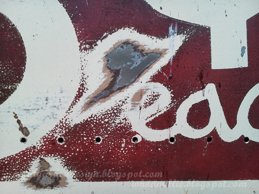
aging painted metal signs

I've done a couple of posts now on how to make vintage-look painted signs on metal panels, but I'm still perfecting my methods as I work my way up to a large project. I have a patch of fence, though, in the backyard, that is chain link, and ugly, and has a tiny dog on the other side (a pomeranian, I think) who likes to bark at us when we're minding our own business in our own yard (but only when he can see us). And I had some metal panels laying around, ready to get made into signs.

A project for every purpose, hmmm?


So, let's not talk about how I should have used a template before taping and spraying so that everything would look a little more professional. I freehanded this in chalk and then taped around it; I know it doesn't exactly dress to impress. But I would like to write a little about my experiments with aging. Aging the sign, that is, not myself. (*wink*)

First, I started with a cream painted metal panel from Bring, the recycled building store where I pick up a lot of my project materials. As you can see in the sanded spot in the photo below, there were three other layers of paint under the cream: tan, brown, and gray before the steel shows through. Picking a panel with a lot of layers of old paint in dated colors is a great first step towards making something look vintage, I think.


After I taped my lines, I sprayed with a flat black primer, and then three very light coats of cherry red. Some of the black still shows through, with I think lends some nice age.

You can tell from the above photo there is a flat finish to the red paint. It was glossy out of the can, but if you hit anything with enough scrubber pads, sandpaper, and steel wool, you can dull the finish pretty nicely. 

As you see here, my next method to aging is to scrub all the way through the layers of paint in several areas, down to the bare metal. I made the patches somewhat random in order to look like "natural" aging. 

And then, of course, rust. I scrub the area with salt while it lays flat, then spray with vinegar and leave it to do its thing. Voila! (It's still wet in this photo, but you can still make it out.)


Ah, rust. I left this laying flat in the rain for a couple of days, which helps hasten the process.


I let the kiddo dance on it a bit, too, to give it some dents and chips.


So, the aging is going well, and this hides a pomeranian. Mission accomplished!


Stay tuned, as I'm in the middle of another sign project I'll be sharing soon. This one is even bigger and way cooler.

Thanks for reading!


Tuesday, September 3, 2013

sweat, or tears, or the salt sea

"'Do you know a cure for me?' 'Why yes,' he said, 'I know a cure for everything. Salt water.' 'Salt water?' I asked him. 'Yes,' he said, 'in one way or the other. Sweat, or tears, or the salt sea.'"
from The Deluge at Norderney
by Karen Blixen, writing as Isak Dinesen


This photograph has hung in our bathroom(s) for fourteen years now; I like it (alot), but I was ready to change things up a little bit.


I found an oil-painted seascape on canvas at the Village and traced chalk letters onto it.


White acrylic paint to fill in the tracings.


Ready to display.


Other examples of quotations painted on thrifted canvases:
  1. A Beautiful Mess
  2. Style By Emily Henderson
  3. Southern Belle Soul
  4. Young House Love
  5. Six2Eleven
By the way, didn't Karen Blixen have a crazy-interesting life? 


Any artwork change-ups going on in your spaces lately? Do tell!

Thanks for reading.

Linking up to:
The Cottage Market

p.s. you can make these images larger by clicking on them, but you probably already knew that, clever you!

Sunday, December 9, 2012

mural painting at mom's house

I found these old photos the other day from maybe five years ago. The mister and I were visiting my mom's house, and she suggested that we paint a tree mural on the guest room wall together. Just the kind of project I like working on!

First, I used a nice, soft pencil (or possibly charcoal?) to sketch out the tree.


Then Mom and I used artist's acrylics to paint in the bark together. Lots of chatting, too, of course.


I'm pretty sure we were done in a day. Of course, that was before I had my kiddo. If I were to have attempted such a thing with my sweetheart in tow, I imagine it still wouldn't be done. ;)


I hear tell that Mom's since added leaves to the tree, but I haven't been out lately to take a peek for myself. There's a set of bunk beds in there now too, for the grandkids, that I always picture looking just like a treehouse.


So: what kind of projects have you collaborated on? Ever take on a big project with a parent?

Thanks for reading! If you're interested, here's a link to a previous post I did about the blue tree mural I painted in my kiddo's room. It took more than a day, as I recall, but then, I was a new mama working on my own, so I try to go easy on myself.

And here's a link to a post I wrote about repairing the mural, after my busy toddler tried to peel all the paint off his wall during nap time one afternoon.

p.s. you can make these images larger just by clicking on them, but you probably already knew that!


Thursday, September 6, 2012

happy labor day!


We spent the recent Labor Day holiday taking turns masking off the windows and priming/painting the first two sides of the house. Even more exhausting with a toddler!

We used this primer and paint in Sweet Corn Yellow. We'll let you know how it holds up! This is our first experience painting with recycled paint; the price is good, and the paint coverage is pretty decent.

What did you keep busy doing over the long weekend?

Thanks for reading!

Wednesday, June 27, 2012

butterfly specimen placeholder art


These frames are the best option we found for framing our monthly photo booth strips (something we started doing regularly about the time of the kiddo's first birthday, but only occasionally before then).

Afraid they'd stop carrying these glass-backed frames, I bought ahead and ended up with an empty frame on my wall. I decided to fill the empty one with some placeholder art until we have photo strips to fill that frame as well. (The glass-backed frames I used for this project are available from Target.)


This is a deceptively easy project. Find some butterfly art in a magazine or as a copyright-free image on-line. Print it out.


Cut carefully. Make sure your cuts aren't too straight or choppy, for the most naturalistic appearance possible. Go ahead and cut off the antennae.


Gather a spool of heavy thread, some double-sided tape, and your butterfly.


Cut a length of thread. Bend and twist at the center, and attach to the back of your cut-out butterfly using a tiny piece of the tape (this will also loosely hold the butterfly to the back pane of glass to help avoid slippage).


Flip over and check placement. Adjust if necessary.


Place in frame, sandwiching the butterflies between two pieces of glass.


I used three different butterflies to mimic the look of a specimen collection; you could switch it up even more and use three different colors of butterflies, or a dozen in different shapes and sizes.


The thread antennae give these a very realistic appearance, especially if you just let them lay, rather than adjusting them until they're perfectly symmetrical.


And in less than a typical nap period, it's done, and ready to hang on your wall . . . permanently, or until something better comes along!

Thanks for reading!

p.s. you can make these pictures larger just by clicking on them, but you probably already knew that.


Linking up to:

Handy Man, Crafty Woman

Tip Me Tuesday at Tip Junkie

A Bowl Full of Lemons

Mommy by Day, Crafter by Night

Today's Creative Blog

DIY Show Off

The Stuff of Success

Mop it Up Mondays at I Should Be Mopping the Floor

Open House Party at No Minimalist Here

Catch as Catch Can at My Repurposed Life

Saturday, June 11, 2011

progress

Promised: shots of this room in progress. I'm not always awesome about updating the blog on a project from start to finish (there are still, for example, a few dozen Alice in Wonderland shots from last summer that I keep meaning to post), but I'm really excited: a) to have the back room useable (the kiddo loves to wrestle pillows on the bed, and bounce, and read Heedley Pecked Me in the Eye for the umpteenth time); b) to have completed such an insurmountable task as cleaning the space out; c) to be able to have visiting friends and family stay with us when they visit, as opposed to a hotel, a campground, or someone else's house. Have I mentioned how grown up that makes me feel at age thirty+? Really, really, really.

Here is the earlier "in progress" shot from a few weeks ago. The headboard is a cut-down old door from Bring. The bedframe came from Craigslist. No, we did not get robbed at gunpoint.


And here is a current "in-progress" shot. The room isn't done yet (is any room in our house ever done?), but you can see, we'd now be comfortable hosting guests here.


The sheets, dust ruffle, and white curtain panels are recent Target clearance. The name-embroidered pillow is a re-worked wedding present with fabric from Ikea and Troismiettes. The coffee sack bolster is made from the remains of the coffee sack I recently blogged about here. The small rectangular pillow is a Target clearance item from four or five years ago, unearthed in The Great Clearing, with added vintage button details. The grey tweed wool on the square pillow came from the Assistance League of Eugene thrift store shortly after I moved up this way. The finger paintings are the work of my favorite baby boy, hung with vintage wooden pant hangers.


This next photo shows a close-up of some really cute little tiki shot glasses from Archie McPhee, repurposed as tiny planters for some hens-and-chicks and baby tears (don't succulents have the best names?). You can see these in the previous photo as well, on the headboard.


Shown here is the night stand vignette, also still in progress.


The night stand is the first piece of furniture my father's parents bought together after their wedding: a sewing machine table. Inside the hinged front panel is where Grandpa, an electrical engineer, attached the foot pedal to the wall of the cabinet so that Grandma could use her knee instead of her foot to operate the machine. This was probably VERY helpful with little kids around; I've discovered how much my kiddo likes to go after the pedal of my own sewing machine when it's sitting on the floor. Being able to keep it away from little hands while in use as well as when put away is pure genius.

The little spatterware pot is something I picked up at the Olde English Flea Market last weekend. Great for holding the watches and earrings of house guests. The book is the aforementioned Heedley, which is well-loved around here. The lamp is a piece of red cedar we kept from our old rental house when we left. The mister cut both ends flat and sanded off all potentially splintery or pokey parts, and I attached a lamp kit.


The search for the perfect shade has turned up this St. Vinnie's drum shade ($2.50). It's not quite right yet, but I'm still considering how to change it into something fabulous.


The window wall. The clock was on the wall for thirty+ years at the BookMark, the first bookstore to ever employ me. There used to be a large sign over it that read, helpfully, "CLOCK". I still have the sign somewhere, too. The barn star only looks old; it came from the craft store. The tin "Days o' Work" art is actually an antique chewing tobacco mold that came from the Salvation Army's local antique/vintage store, Tea & Crumpets. It's a regular old Salvation Army store now, but for awhile it held a pretty awesome collection of 1920s-1930s inlaid British wardrobes, old photographs, and glassware.


Our Ikea chair folds out into The World's Most Comfortable Cot. People have been sleeping on this in our living room or {former} office for years. Now it makes this room perfect for guests with kids. The corduroy pillow is a Fred Meyer clearance pillow (from six or eight years ago) that I tufted with some buttons. The coffee sack pillow is blogged here. The pillow covers on the seat of the chair were purchased with the bedspread (see bed photo) at Value Village. More about that in a minute.


One of my favorite collections, rediscovered in this room a couple of months ago, is my collection of vintage rackets and paddles. You can find these inexpensively at almost any thrift store, but one of these is my hubby's high school racket. Can you spot it? It's the one peeking up in the bottom left corner.


This is the first racket I ever bought, back in high school. The Salvation Army used to run a salvage store in my home town. Maybe they still do! You could buy clothing there by the pound, and I did. I think I paid a buck for the racket, too. Everything was way underpriced, even by thrift store standards. I later used the racket in a college tennis class, and the PE teacher thought it was awesome. Still strung tightly, with lots of bounce. The Scrabble letter sign (from a vintage 1970s set found at Value Village) takes on a double meaning when displayed with the rackets.


There are a million little details I'm still working on, and I'm saving the closet makeover for another post, but this should give you an idea how things are progressing. It's been so much fun arranging little treasures in here, and we've spent more time in this room in the past couple of months that we have in the past five years. It's been like increasing the size of our house by 10%, and we love it.


One last note, and a nicely lit bed view: The bedspread you see here came from Value Village, together with the two pillow covers you saw on the chair seat. They were a deep charcoal gray when I bought them. Too dark, I thought, for the room, but I liked the texture, and the size and price were right. So, despite knowing better from years of textile and surface design classes in college, I decided to try and fade the color with bleach.

Bleach doesn't just fade black. In fact, if you soak most black textiles in bleach, you'll get some variation of yellow, brown, or orange, not white. I ended up with a bedspread that was Beaver State orange. Over-dyeing with Black Velvet and Jeans Blue Dylon dye turned it chocolate brown. Not at all what I'd intended, but it'll do for now. Sometimes dye accidents aren't the end of the world. In this case, it goes nicely with the reproduction Swiss army blankets from Mills Fleet Farm.


There you go! Consider yourselves updated!

Thursday, May 5, 2011

tabula rasa

I'll be posting more pictures of this soon, but this photo here represents about a hundred hours of work spread out over a month. More if you count the time I spent a few years back stripping the paint off that door and patching and sanding it. That was back when we'd intended to use it for a door.


So the reason for all the hours, for such a "before" looking image? This room, a few weeks ago, was packed to the brim with bins of art and craft supplies, childhood mementos, display items from my former bookstore, and theater leftovers. It's taken a monumental effort to get to this photograph: a clean slate, painted a soft, silvery gray, with the beginnings of a door-turned-headboard on the wall.

I've lost count of the trips to the charity store's donation drop-off. I've given a few things to friends. We held a one-day yard sale that paid for the bed frame and paint. And there's plenty stashed in the studio, and some stuff on my kitchen table ready to get the boot. The recycle and trash bins fill faster than Sanipac can haul it all away, so a friendly neighbor called the city to report us a couple of weeks ago. I frequently feel overwhelmed by the task at hand, which is essentially sifting through and getting rid of so much of my old self in order to have a clean, quiet space. One that we're intending for a guest room, but which the cats are pretty sure is really just for them.

Anyway, I'll go into more detail about the process later. That's all for tonight!

Monday, July 13, 2009

Neverland

A few shots of one of the major projects I worked on for our recent production of Peter Pan as well as one of me, in my Nana disguise (I made the velvet helmet with ears {a recycled faux fur collar from a Goodwill} and ribbon ties; Rosalie G. beautifully executed a tiny mob cap for the top using leftover recycled-bedskirt-fabric from her handmade Liza apron. GORGEOUS).


This Neverland Map was created over the course of several weeks. Shawn and I built six 5' x 2' canvases out of scrap wood from an old pallet, and one large painters' dropcloth from the hardware store. The canvas was stapled in place, and then I painted this original map of Neverland using acrylic paints and brushes of various sizes. I researched place names mentioned in Barrie's original book, as well as the sequel, but because Neverland is always moving things around (perhaps some inspiration for the Hogwarts staircases?), I was pretty free to interpret the shape of the island and the lay of the land.

To finish, some mesh (recycled from an old mattress) was stapled over the back of each frame, and hinges attached the panels into two 3-panel screens. These were used in the parks as a backdrop and as an exit point for cast members.

On windy days, we tried many methods of keeping the screens upright, especially at our grassy venues. In the end, the father of two of our cast members ended up holding them upright from behind. Someday, I hope to invent a fool-proof method of keeping such things upright in outdoor theatre.

Clickable photos reveal larger versions.